Hotjar has quickly become a favourite tool at Reload.
It reveals a goldmine of information about how users behave on your website. However, understanding how to interpret this information correctly is critical if you want to take advantage of this awesome tool, crack open your website potential, and hopefully see all those leads and sales fall out.
I know you’re all as eager as Veruca, so we’ve put this into 5 easy points to get you well on your way on how to understand your sweet, sweet Hotjar results!
1. How do I find where my users are spending the most and the least amount of time?
Okay so say you’ve built some sort of content piece on your website, and you’re hoping that people will find value in it. You want to know for sure it’s being interacted with right? Well this is what you look for:
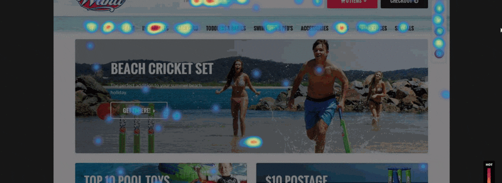
Click Map and Scroll Map
Let’s dive in and have a look at the click map and see what it reveals in conjunction with the scroll map.
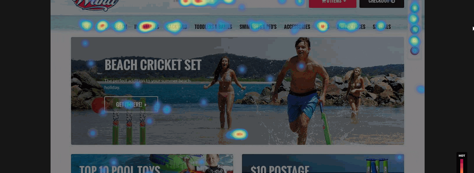
We saw that the ‘Items on Sale’ and ‘New Arrivals’ below the fold were getting clicks, but didn’t have a lot of them.
By looking at the scroll map below, we can see that the reason behind this is that only 56.4% of all visitors had scrolled this far down. This means that almost half the traffic did not even reach the items on sale and new arrivals side of the website, even though it had a high click through rate.
Crazy right? So what does that mean?
From this data, we can infer that if the Items on Sale and New Arrivals buttons are pushed up to the top to somewhere that’s more visible, then it is likely we will immediately start driving more customers to this area of the website and potentially increase revenue. Just by doing that!
Of course we still don’t know if by doing something like this will work in real life without testing, however what we do know is that a lot of people are clicking on this section of the website despite this section of Wahu being halfway down the page. Pretty cool right?
So in the same vein, if you have a blog for example that’s not having too many people visiting it, install hotjar!
Then, you can start to see the percentage of visitors that actually reach and engage with your posts.
2. What are the major barriers my audience is experiencing?
To discover this, it’s simple.
Polls!
Ah yes, good ole market research tools. As marketers, we sometimes have a bias that people don’t fill these out, but it’s because we probably wouldn’t fill them out ourselves (except me because I’m weird).
But what we don’t realise is that polls and surveys provide an avenue for users to unload their frustrations into, and gives you the laser-accurate information you need to improve your website.
Polls and Question Bank
It’s quite straight-forward, you go to Polls within Hotjar and then you fill out the type of survey you would like to ask your audience.
You have to make sure that the questions you ask will give you the right type of information. For example, if you want to know why people aren’t submitting enquiries on your landing page, type in “What stopped you from making an enquiry with us today?” or “Is there some information missing that you’d love to know?”. Easy!
If you’re stuck for ideas, Hotjar also provide a Questions Bank that lets you go through all the questions that Hotjar have collated to give you awesome ideas on the right type of questions to ask.
So how do you interpret polls results?
It’s quite straightforward. Find out what is the most common used word in the results, and you’ll quickly find a pattern of what users are wanting to see on your website. The best way we’ve found to do this is to set up an excel spreadsheet and find out the common theme and sort your information by topic. Soon you’ll have a better understanding of what your audience is yearning for; because hey, nobody fills out a survey unless they really want you to know about something right?
3. Identifying dead spots on your website
Heatmap and Move Map
From our map analysis, we suggested Wahu move up the areas that ARE being clicked on. In this case, we saw a huge amount of activity around the Categories navigation bar, indicating that the audience are looking to navigate to the product listings to browse.
From here, what we decided to do was to move up the Categories Boxes to where the banner was.
This is probably my favourite insight and it provided us an awesome amount of information.
So what happened?
BOOM! Just as anticipated, we saw that the Pool Category button increased in clicks by 196%! Effectively, this helped Wahu to drive more traffic to pages that matter the most at a business level, as well as improving engagement. However we would not have known this insight if it wasn’t for Hotjar’s heat-mapping tool.
4. Page frustration is real…
It’s all too common when users can’t find what they’re looking for to experience anxiety, frustration, and to just go a little crazy. However, it can be a little hard to purely measure this at a data level – which is where (again!) Hotjar can lend a helpful hand.
User Recordings
So to find out where people are losing their minds a little bit, or are unsuccessfully trying to find something, recordings are a life saver and a provide a treasure trove of information.
The key takeout here is watching their mouse activity. If and when users start making fast, explosive zig zags with their mouse followed by a string of clicks, that’s what frustration looks like on a website.
The way to find out what triggered them to go into this frenzy of clicks and mouse squiggles, is to see what action they were taking just before this happens. This information is super valuable as you can find the areas on the site that are giving a poor user experience, which, when improved can improve overall engagement metrics, as well as increase website conversions.
5. Find out where people are getting distracted
People are prone to distractions; just like a dog getting distracted by a passing dump truck even though you’ve got a juicy steak in front of it. People can become distracted if you aren’t careful.. You’ve lost little Fido.
Distracting elements are conversion killers. You could have a great promotion on your site and you’re really wanting to drive users to take this amazing offer, but something as annoying as a rotating banner can be killing your conversions.
We found that users were clicking on the banner slide dots rather than the actual offer on the banner. Maybe you included your awesome offer on the second banner slider, but say your banner slides to the next banner every 5 seconds.
People will try and go back but it’s so flipping annoying when you’ve got these tiny navigation dots and you literally have to aim your mouse just to click it!
Alright I’ve vented, but seriously I’ll tell you a massive secret that’ll instantly increase your click through rate on promotions you care about. Here we go…
Use a static image.
I know, genius right?
You wouldn’t have known this without this amazing heatmap tool.
So if you’re looking to push an important promotion, try removing sliders and just including a single, static image.
If you need to implement different offers for different audiences, try a personalisation platform like Personyze that will switch this static image based where your users are coming from or their past browsing/purchase history.
It’s not groundbreaking information, but you will see an increase in clicks to your offer and potentially see more revenue/leads come your way.
In summary
Heatmaps are such a powerful tool that can quantify qualitative data that is critical in understanding where people are finding the biggest barriers on your website.
However, interpreting these results correctly is equally – if not more – important. When talking about user experience optimisation or conversion optimisation, this data is crucial and can lead to valuable findings which can make a huge difference in how users interact with your site.
Get in touch with Reload today to find out how we can help you interpret user behaviour and improve your user experience with Hotjar!